CASE STUDY
Transforming experience through design, performance, and SEO.
BACKGROUND
Dufour Collaborative, a prominent event company in the DMV area, approached me to revamp their website, recognizing that their old site no longer reflected their growth and evolving brand. They needed a fresh design that would not only represent them today but also scale for the future.
As the project lead, I drove the strategy, UX/UI design, and SEO implementation to deliver a website that truly captures the essence of their brand. While I collaborated with a developer to bring the design to life, every aspect of the site—from research to execution—was shaped by my vision and expertise.
MY ROLE
Project Lead & Creative Strategist
THE PROBLEM
Dufour Collaborative needed a modern website to better showcase their innovative event services and connect with a broader, more diverse clientele.
Project Timeline
Phase 1: Research and Discovery
Understanding the Problem: A 360º Research Approach
Before diving into the redesign, we needed to understand the full picture—not just from one perspective, but from stakeholders, clients, and vendors. Through interviews and research analysis, we uncovered key themes that helped us shape our approach:
Stakeholders felt the website wasn’t doing the company justice. It lacked current work, engaging visuals, and ways to connect with visitors.
Clients wanted more personality—something that felt approachable, clear, and visually dynamic. They also wanted to see progress shots, a breakdown of skills, and stronger communication touchpoints.
Vendors found the site static and templated, questioning its uniqueness and visual appeal.
Their feedback was direct:
“We need SO MUCH MORE!” – Stakeholders
“Hm.” – Clients
“Does it do anything else?” – Vendors
Turning Insights into Action
Instead of just listing out problems, we needed a structured way to prioritize what mattered most. That’s where our Affinity Map → Trends & Patterns → Priority Matrix process came in:
Affinity Mapping – We sorted every piece of feedback into clear themes.
High-Level Analysis – We identified recurring patterns across all audiences.
Priority Matrix – We mapped out what was a Must-Do versus a Nice-to-Have so the new site could deliver the biggest impact.
This process ensured that our redesign wasn’t just a visual upgrade—it was a strategic transformation, aligning user needs with business goals.
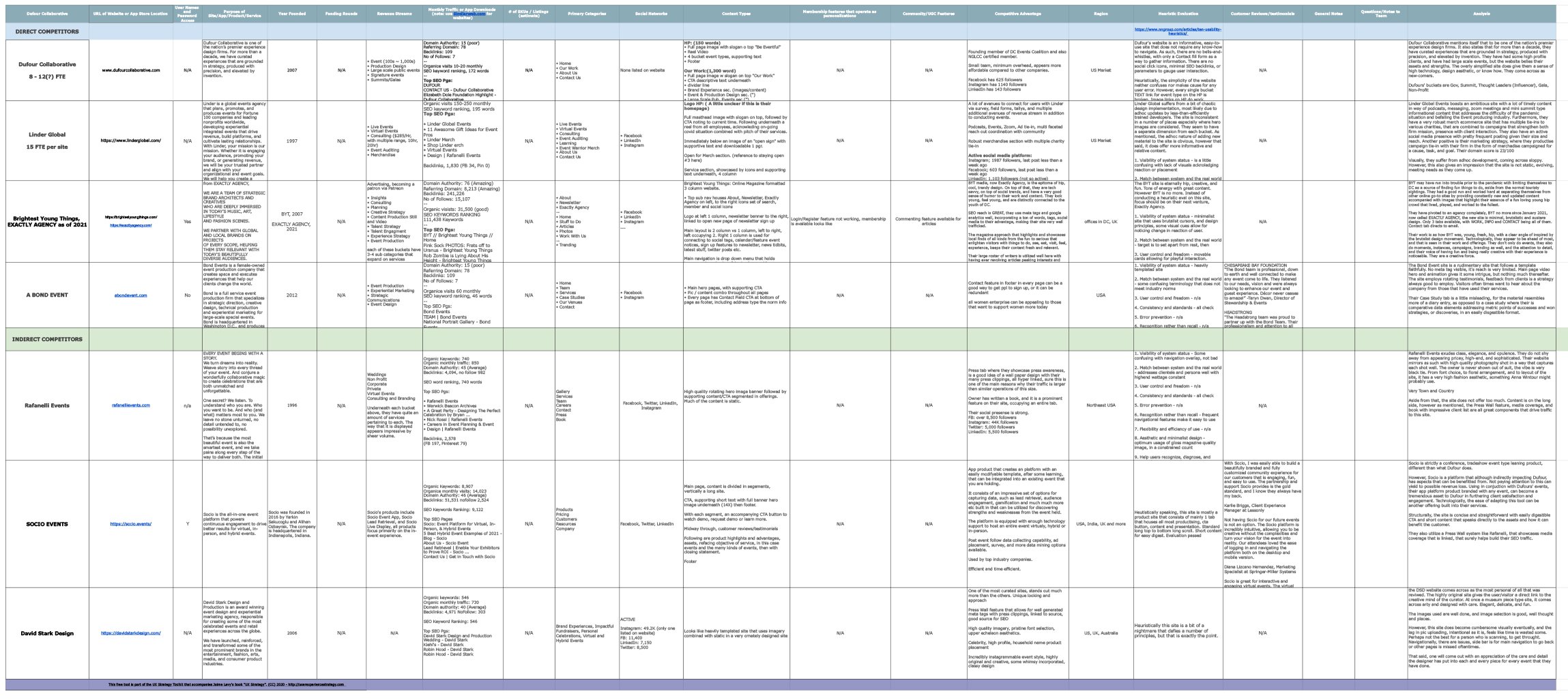
SEO Analysis
4
direct competitors
4
indirect competitors
Cultivating Long-Term SEO Growth: A Strategic & Competitive Approach
SEO isn’t a one-time fix—it’s a living, breathing ecosystem that thrives with continuous care. Much like nurturing a garden, success comes from consistent cultivation, adaptation, and strategic growth. Our approach follows a cyclical process, illustrated in our framework: Research, Planning, Implementation, Monitoring, Assessment, and Maintenance. Each phase feeds into the next, ensuring that as search algorithms evolve, so does Dufour Collaborative’s digital presence.
To bridge this gap, we’ve outlined a comprehensive roadmap that prioritizes:
Keyword Research & Content Strategy – Targeting high-value industry keywords, optimizing meta descriptions, and structuring pages for search visibility.
Backlink & Authority Building – Establishing strategic guest posting, PR outreach, and high-authority link partnerships to strengthen domain credibility.
Technical SEO & Performance Enhancements – Ensuring site speed, mobile responsiveness, and structured data implementation to improve rankings.
Local & Social SEO Integration – Enhancing Google Business Profiles, leveraging social signals, and executing targeted campaigns to drive engagement.
By continuously refining these strategies and nurturing SEO as an adaptive, data-driven process, we’ll ensure Dufour Collaborative not only ranks higher but maintains a strong competitive edge in the digital landscape.
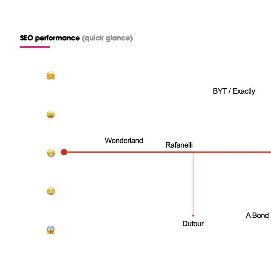
Through competitive analysis, we identified key gaps affecting Dufour Collaborative’s SEO standing, including low domain authority, limited referring domains, and missed content optimization opportunities. Compared to industry leaders like BYT (DA: 76) and Linder Global, who leverage strong backlink networks and content-driven SEO strategies, Dufour needs a more robust link-building approach and enhanced keyword optimization to increase search engine visibility.
Dufour ranked low in SEO compared to competitors, highlighting the need for a strategic overhaul.

Website Audit: Identifying Key Challenges
Homepage
The previous Dufour Collaborative website functioned more like a static print piece than a dynamic, user-friendly digital platform. While visually appealing, it lacked web optimization, making it difficult to scale, update, or engage users effectively. The structure did not prioritize SEO, which significantly limited discoverability and search performance. Additionally, key content was buried in long-scroll formats without clear pathways for navigation, making it challenging for users to find relevant information efficiently.
Our Work Section: Lack of Hierarchy & Accessibility
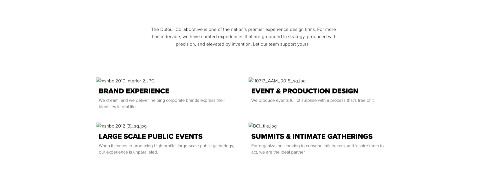
The Our Work section, intended to showcase the firm’s expertise, suffered from content overload and poor categorization. Projects were displayed in a linear, text-heavy layout, making it overwhelming for users to browse. Without filters or a structured approach, visitors had to scroll extensively to locate specific case studies. This lack of hierarchy not only impacted usability but also diminished the visual storytelling impact that is crucial for an experiential design firm.

Bridging UX Theory with Real-World Business Needs
Unlike traditional UX case studies that focus on building new products from the ground up, this project reflects the realities of business-driven digital transformation. Our goal was not to reinvent the wheel but to strategically enhance an existing website within the client’s constraints—cost, time, and long-term maintainability. The decision to use a template was not a limitation but a necessity, ensuring the client could manage updates independently without reliance on developers.
This approach adapts UX best practices to align with real-world business constraints and client expectations. While large-scale, well-funded projects often have the resources for extensive iterative testing across multiple fidelity levels, our focus was on delivering a high-impact, immediately functional solution. In this case, edits were guided more by stakeholder vision, evolving business needs, and aesthetic refinements rather than traditional usability testing cycles or user flow optimizations.
By embracing this pragmatic UX methodology, we delivered a solution that balanced strategic improvements with business realities—proof that effective UX is not about complexity but about meeting real client needs in the most efficient and impactful way.

Phase 2: Site Strategy & Design Direction
Optimizing Digital Experience with a Scalable Sitemap & SEO Strategy
To future-proof their digital presence, we restructured their sitemap for improved usability, content discoverability, and SEO performance. This, combined with a migration from an outdated SquareSpace CMS to WordPress, allowed for greater scalability, customization, and long-term growth. We also integrated conversion-driven features like CTAs, breadcrumbs, social sharing, and structured navigation, ensuring a high-performing website that enhances search visibility, user engagement, and functionality.
Integrating Motion for a More Engaging Digital Presence
Beyond structure and SEO, brand identity needed movement. To enhance user engagement and storytelling, we developed dynamic motion graphics concepts that align with Dufour Collaborative’s identity. The proposed logo animations—Ying + Yang, Pacman, and Digi Square—bring structure, rhythm, and energy to the brand, reinforcing its modern, high-impact presence. This motion-driven approach ensures visual continuity across the website while making key brand moments more memorable and interactive.

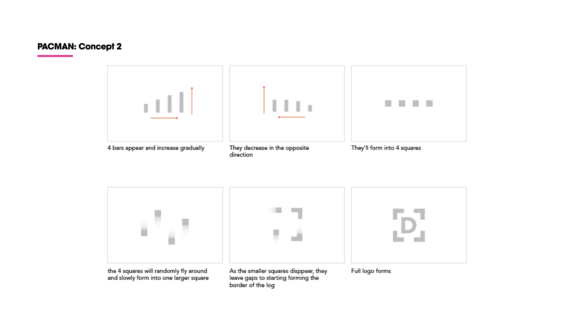
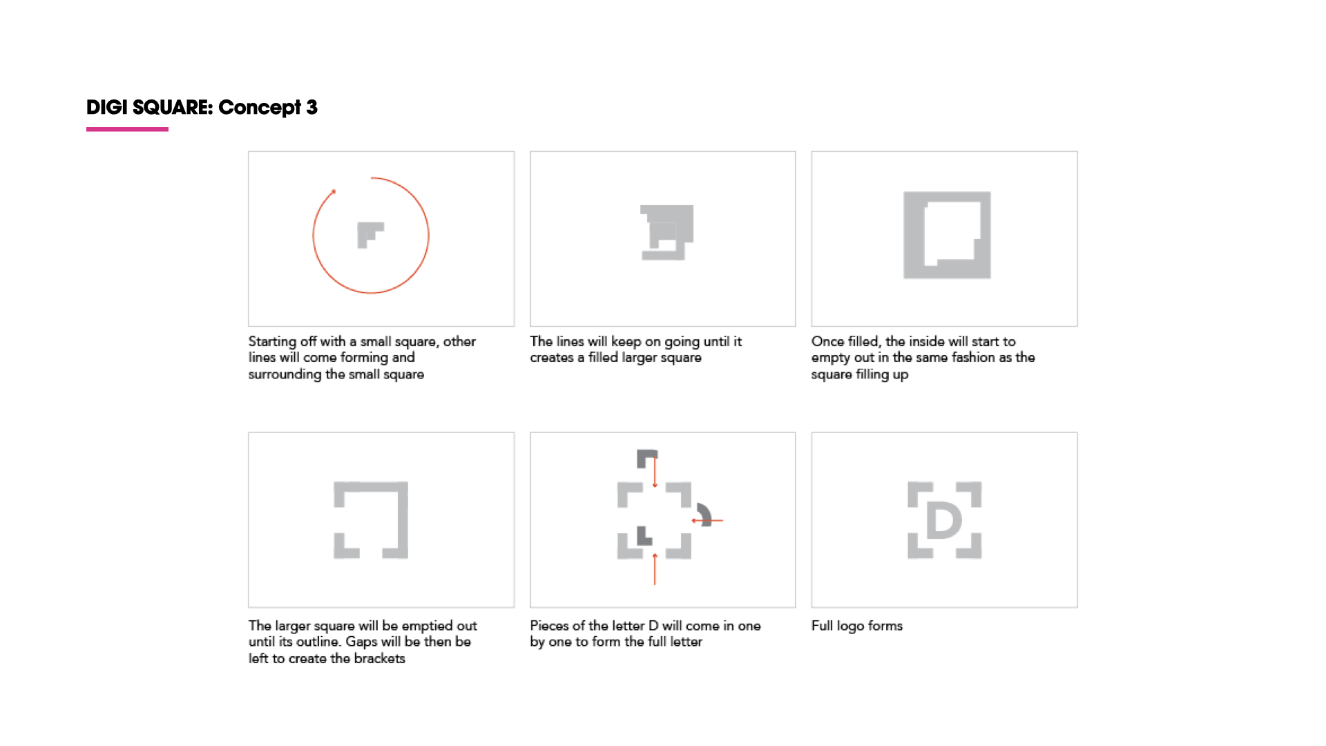
Defining Visual Direction: Moodboards as a Bridge Between Strategy & Execution
With IA, SEO, and motion strategy in place, the next step was establishing a visual language that aligns with both the brand’s identity and user expectations. To ensure brand consistency, we incorporated Dufour Collaborative’s existing brand colors, seen in the color bands on the top right of each moodboard, reinforcing their visual identity throughout the design. We explored two distinct moodboard directions.
Rembrandt – A sophisticated, warm, and grounded aesthetic, blending earthy tones, human connection, and classic refinement. This approach leans into authenticity, trust, and understated confidence.
In Your Element – A bold, energetic, and dynamic take, with vibrant colors, immersive experiences, and a futuristic edge. This direction emphasizes innovation, excitement, and forward-thinking storytelling.
Rembrant
In Your Element
Both directions serve as visual explorations that help bridge strategy to design execution, ensuring that the final UI design remains intentional, engaging, and aligned with the brand’s evolution.
Developing Personas: A Foundation for a User-Centered Website
To build a website that truly serves its users, we developed three key personas—Stakeholder, Client, and Vendor—based on direct research and feedback. These personas are more than just representations; they are strategic tools that ensure the website aligns with real needs, expectations, and behaviors. By identifying goals, pain points, and opportunities, we crafted a design strategy that balances business objectives with user experience. This approach guarantees a website that is intuitive, engaging, and impactful for all intended parties involved.
Strategic Template Selection: A UX-Driven Approach
Rather than building a custom-coded website from scratch, we took a UX-first approach in selecting the right WordPress theme, ensuring it aligned with the client’s business needs, scalability, and user experience goals. After an extensive evaluation process, we chose Roneous, a flexible and high-performing template that provided the exact features required—without unnecessary complexity.
We implemented Roneous' Main Navigation & Search Bar Splash for a streamlined, intuitive experience. The structured nav ensures easy access, while the full-screen search overlay enhances usability and content discovery.
We integrated Roneous' Sticky Navigation to enhance accessibility and user flow. This ensures key pages remain within reach as users scroll, reducing friction and improving navigation efficiency.
We leveraged Parallax Scrolling to create a dynamic, immersive experience. This subtle motion effect adds depth, guiding users’ focus while enhancing visual engagement without overwhelming content.
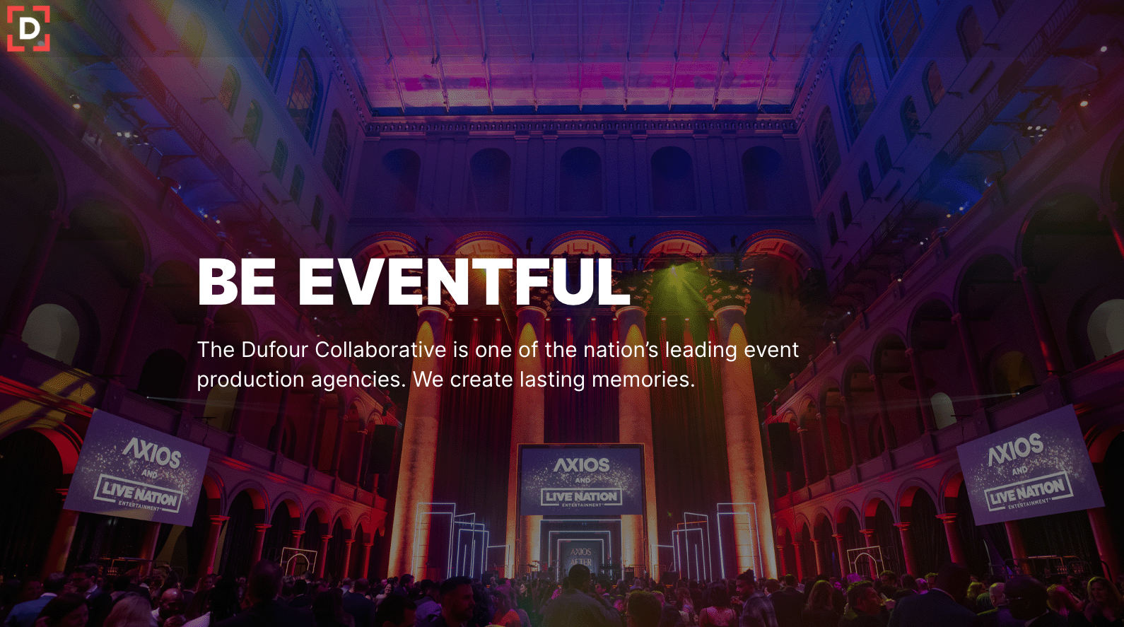
We are implementing a full-width hero section with an image overlay to create an immediate visual impact. The centered content ensures a clear focal point, while the semi-transparent navigation and dropdown menu maintain a seamless user experience without distraction.
To validate our decision, we conducted a feature audit, mapping the client’s requirements—CTAs, media integration, SEO optimization, interactive elements, and user-friendly navigation—against the template’s capabilities. This eliminated guesswork, streamlined development, and allowed the client to maintain their site with ease and autonomy.
This strategic selection was not a shortcut—it was an informed, intentional decision that prioritized efficiency, functionality, and long-term maintainability.

Phases 3 and 4: Concurrent Prototyping, Testing, and Development
Rather than following a traditional linear approach, design and development progressed concurrently to meet project deadlines effectively. While we refined the design and conducted usability testing, our development team simultaneously worked on building and implementing features. This collaborative process allowed for quicker feedback loops, real-time adjustments, and a faster turnaround without compromising user experience or functionality.
Wireframing: Balancing Speed, Strategy, and Client Expectations
For this project, the wireframing phase moved swiftly from mid-fidelity to high-fidelity to align with the client’s business needs. Rather than prolonged iterations on low-fidelity sketches, we focused on developing structured mid-fidelity wireframes to establish content hierarchy and functionality before transitioning into high-fidelity prototypes. The minimal amount of mid-fidelity wireframes were sufficient to create a foundation, ensuring the layout, navigation, and key interactions were clearly defined before visual refinement.
This accelerated approach met the client's need for a tangible, polished preview early in the process while still maintaining the UX rigor of structured planning. By blending speed with strategy, we ensured a streamlined, research-backed execution that balanced aesthetics with usability.

Round 1: Defining the New Vision
The first design presentation was a success, addressing most of the pain points identified in our earlier research. While our initial approach included showcasing progress shots to highlight the firm’s process, the client opted against it, citing concerns over confidentiality and the protection of proprietary intellectual property.
Despite this adjustment, the redesign delivered a site that was modern, dynamic, bold, and visually striking—a true reflection of the brand’s future aspirations. For the first time, it felt as though the client could see the version of themselves they wanted to become.
The design we delivered marked a significant shift in the client’s identity and how they wanted to be seen anew. Their feedback was swift and focused, offering clear direction for the next iteration and setting the stage for an even more refined design in Round 2.
Evolving Brand Identity
Align their brand identity with their evolved vision and values.
Replace bold reds and heavy textures with a refined elegance and new color palette.
Balanced modern aesthetics with professionalism.
Updated icons and visuals to reflect growth.

Round 2: Future-Proofing with Flexibility and SEO Integration
In Round 2, we focused on building a digital presence that could adapt to evolving trends and technology while staying aligned with the client’s refreshed brand identity. We leveraged a flexible WordPress CMS, allowing for seamless content updates and scalability without the need for backend redevelopment.
We also began integrating SEO metrics directly into the backend:
Metadata templates for effortless optimization of new pages.
Schema markup for rich search results and better indexing.
Optimized content structure to improve crawlability and ranking potential.
By incorporating accessibility best practices and preparing for potential future enhancements (such as Progressive Web App functionality), we ensured the site remained legally compliant, usable for all audiences, and adaptable for future technology.
This round solidified the site's foundation for long-term success, creating a modern, responsive, and SEO-friendly platform designed to grow with the client’s evolving needs.
SEO Strategy: Ambition vs. Implementation
The timeline was designed with an extensive SEO strategy in mind, aimed at maximizing the site’s visibility, authority, and engagement across search engines.
This strategy encompassed:
Technical SEO Optimizations (Implemented):
Metadata Tagging: Optimized title tags, meta descriptions, and image alt text for better search engine indexing.
Content Tagging: Proper use of H1, H2, and H3 tags to improve content hierarchy and search engine crawlability.
Web Development Optimization: Enhancements for faster load times, mobile responsiveness, and clean code structure.
XML Sitemap and Robots.txt Configuration: To guide search engines through the site’s architecture.
Canonical Tags: Avoiding duplicate content penalties.
SSL Security Implementation: Ensuring site security for SEO ranking boosts.
Content and Engagement SEO Strategies (Proposed but Not Implemented):
Content Marketing: A consistent blog strategy targeting relevant keywords and user queries.
Social Media Strategy & Campaigns: Driving external traffic and improving brand visibility through ongoing social presence.
Backlink Building: Partnerships and collaborations to build links from authoritative sources, improving domain authority.
Google Ads and Paid Campaigns: Paid traffic generation for higher visibility in competitive keyword areas.
Schema Markup Integration: Enabling rich snippets for enhanced search result visibility (events, reviews, etc.).
Local SEO Optimization: Targeting localized search queries with Google My Business integration and location-based keywords.
Missed Growth Opportunities
Despite this comprehensive plan, the client opted for a minimal approach, focusing solely on backend SEO elements. This left potential gains in organic traffic and broader digital visibility untapped—especially in areas like content-driven engagement, social traction, and authoritative backlink development. The groundwork was laid for future scalability, but the opportunity for a robust presence-building strategy remains underutilized.
Preparations: Quality Assurance and Client Empowerment
The Final Stretch
The pre-launch phase is often the most intense and nerve-wracking stage of any project. Both the team and the client, after months of dedication, anticipation, and hard work, are eager to see the results live. Expectations are sky-high, and nothing short of a seamless, flawless launch will suffice.
This phase is all about fine-tuning—what I call the massaging and tweaking stage. From efficient coding to spell-checking, every detail is scrutinized to ensure no “T” goes uncrossed and no “I” undotted. Last-minute edits, changes, and enhancements are inevitable, and this flexibility ensures the site launches in its best form.
We meticulously verify that the website performs optimally across all devices and browsers. Every piece of content is optimized for peak online performance, and a thorough quality assurance checklist ensures nothing is missed. Fortunately, the beauty of the internet—unlike print—is its flexibility. Post-launch improvements, updates, and further optimizations remain possible, but a solid foundation guarantees a smooth debut.
User Testing Insights: Client-Driven Usability Adjustments
While traditional user testing wasn’t feasible for this project, we gathered valuable input directly from the client. This feedback led to a significant shift in the site’s structure. Instead of a long-scrolling client showcase, we developed a dedicated section for each client. This allowed users to dive deeper into individual case studies, offering a more immersive and organized browsing experience.
Accessibility Improvements: Designing for All Users
The rebrand introduced new colors, including a variant of yellow that initially posed legibility challenges. We advised against placing light text over bright backgrounds to improve readability, particularly for users with visual impairments. This attention to accessibility extended across the site, ensuring better contrast ratios, clear typography, and an inclusive browsing experience for all users.
Content Strategy: Designing for Storytelling
The client initially struggled to develop content that reflected their brand’s evolution. Our design solution—creating expandable client sections with metrics, client feedback, and visuals—helped unlock their storytelling potential. By visually representing how each project could be showcased, we inspired the client to develop rich, engaging content that added depth and personality to the site.
Developer Collaboration: Efficient Handoff Through Figma
Collaboration with developers was streamlined, we used Figma to develop and share high-fidelity wireframes, ensuring an efficient transfer of content and design elements. This approach kept the development process organized and allowed for seamless implementation of design specifications.
Analytics Setup: Empowering the Client with Data
We set up Google Analytics and provided comprehensive training to help the client monitor site performance. Though not fully taken advantage of these tools, the foundation for data-driven decision-making was established, offering them the ability to track engagement, user behavior, and SEO performance post-launch.
Post Launch Support and SEO Outcome
Post-Launch Support and Handoff Documentation
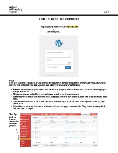
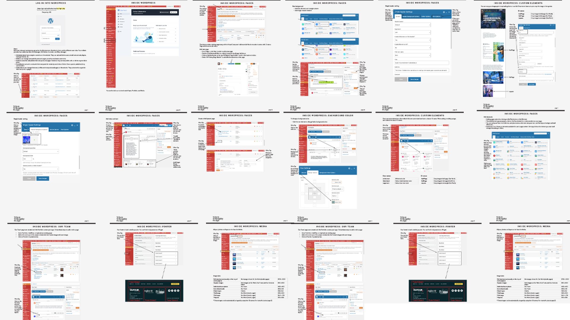
To ensure long-term scalability and empower the client to manage their website independently, we developed a comprehensive training manual. This document covered all essential aspects of managing the WordPress-based platform, including user permissions, content updates, media uploads, and layout adjustments using the Visual Composer builder.
The guide also provided step-by-step instructions for:
Creating and managing new pages, including team profiles and client showcases.
Uploading and optimizing media assets for web performance.
Maintaining consistent visual identity through custom ID names and class elements.
Adjusting background colors, layouts, and fonts for future content updates.
Additionally, we conducted a training session to familiarize the client’s team with the platform and best practices for content management. This proactive handoff allowed the client to scale and update their site independently while maintaining the integrity of the original design.
SEO Performance & Post-Launch Impact
A 9,900% Growth Success Story
After launching the redesigned site on January 31, 2024, the impact was immediate and dramatic. By focusing on structured SEO implementation, performance optimization, and keyword-driven strategies, the site saw a staggering:
SEO Performance Highlights
+9,900% increase in total site traffic (previously averaging 7-15 users per month, now attracting hundreds in just 4 weeks).
+564% increase in total page views (huge spike in engagement post-launch).
+726% growth in event-based user interactions (clicks, page views, form starts, and other engagement metrics).
Expanded traffic sources beyond direct visits → New pathways from Organic Search, Referrals, and Organic Social.
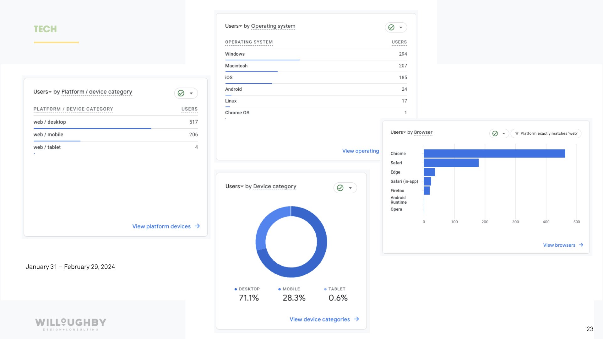
More devices actively engaging → Traffic now coming from desktop, mobile, and tablet users, expanding reach.
SEO Optimizations That Made This Possible
Comprehensive Keyword Strategy → Integrated high-impact event-related keywords into meta descriptions, headers, body content, alt text, and links.
Technical SEO Enhancements → Optimized page load speed, structured data (schema markup), and mobile responsiveness.
Content Structuring for Better Search Visibility → Ensured site architecture supported Google’s ranking criteria for usability and relevance.
The Challenge: Still Below Google’s SEO Benchmark
Despite massive improvements, Google’s recommended SEO engagement rate is 60-75%, while the site currently sits at 59%.
Next Steps & SEO Recommendations
To further enhance search ranking and visibility, the following should be implemented:
Improve meta descriptions to increase CTR from search results.
Develop a backlink strategy by integrating social posts and external site references.
Encourage Google reviews to build trust and improve rankings.
Upgrade to Yoast Premium for advanced SEO automation and insights.
Run Google Ads for targeted brand awareness and conversion-driven results.
Launch a blog & PR section to expand authority and organic search traction.
Final Takeaway: This is Just the Beginning
With minimal SEO investment, the new site still saw explosive growth. By fully implementing content marketing, social integration, and continued optimization, Dufour Collaborative can secure long-term visibility and industry dominance.
+9,900% increase in site traffic
+564% increase in page views
+726% growth in event-based user interactions
Expanded traffic source
More devices actively engaged

NEXT CASE STUDY >>


